Until now, I’ve been primarily testing Mapkind GPS on my phone in portrait orientation — first, for convenience, since my phone is always close at hand; and second, because the phone is more challenging to design for due to its limited screen size.
I don’t know about you, but when I’m out exploring forest roads in a vehicle, a dashboard-mounted tablet is far preferred!
So last Sunday, I loaded a build onto my iPad mini 6, mounted it to the dashboard of our Defender in landscape orientation, and spent the afternoon exploring the mountains above Tucson.
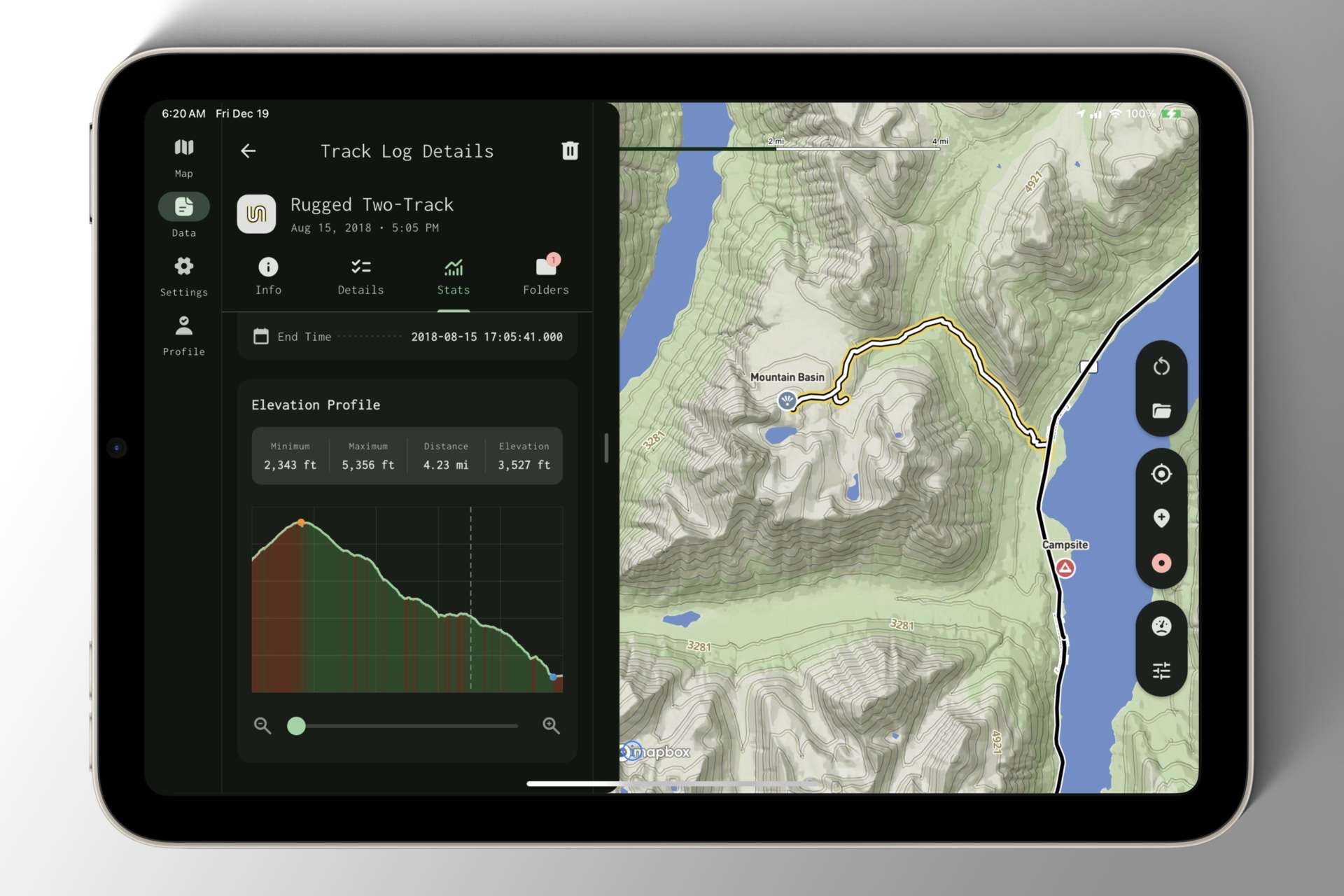
As I interacted with the app, it became immediately apparent that I had been giving the phone UI too much precedence. The Navigation Bar was spread awkwardly across the bottom of the display, and the navigation stack consumed the full width of the screen — an atrocious amount of wasted space.
By the time I got home, I knew I needed to prioritize changes that preserved the polished phone interface while elegantly reorganizing components for the tablet.
Don’t let the screenshot fool you — this is an early iteration of the tablet layout, wrought with gremlins and display bugs, but it’s a giant leap in the right direction!