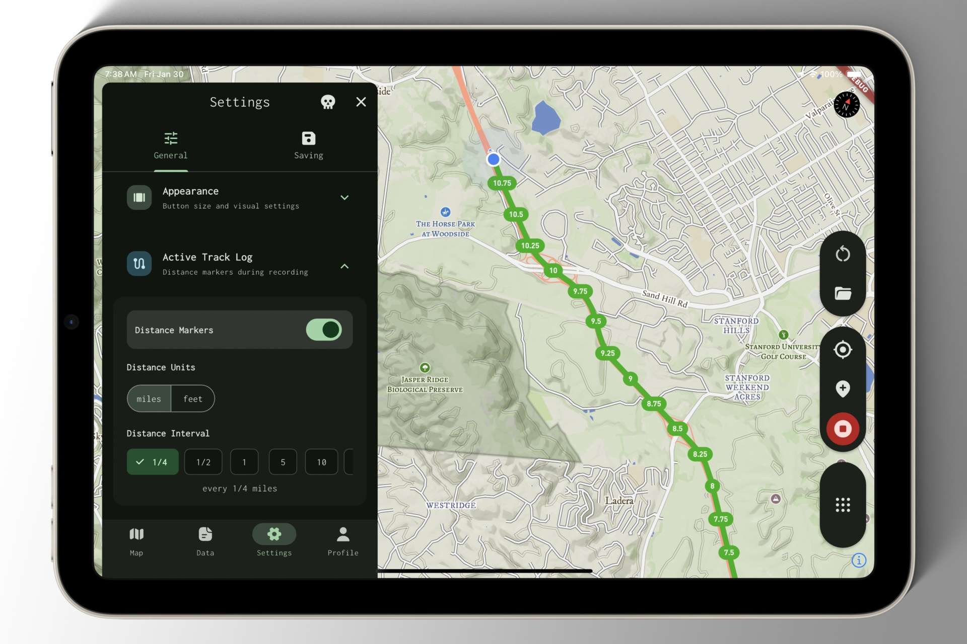
This past week, I refactored the active track log visualization — the green line drawn behind your puck as you move.
Previously, we had no control over where the line rendered on the z-axis. In other words, it was drawn on top of everything: waypoint markers, route number shields, road labels, and more. This often obscured important map details needed for navigation.
Not cool.
Now, we can specify exactly where the line renders on the z-axis, ensuring it doesn’t cover anything you need to see — an essential improvement and a much better experience.
While I was under the hood, I also introduced a first iteration of distance markers: a toggleable feature that enables pill-shaped progress markers showing the distance you’ve traveled directly on your active track recording.